Loading...
Loading...
Loading...
Loading...
Loading...
Loading...
Loading...
Loading...
Loading...
Loading...
Loading...
Loading...
Loading...
Loading...
Loading...
Loading...
Loading...
Loading...
Loading...
(optional)
The label of your component. If not label is specified, then last part of name will be used when component is dropped into Designer. If your component name is appmixer.twitter.statuses.CreateTweet then CreateTweet will be name of the component unless you specify label property. This allows you to use spaces as opposed to the name property.
Description of your component. The description is displayed in the Designer UI inspector panel like this:
The description should not be longer than a sentence or two. Example:
The authentication service and parameters. For example:
The auth.service identifies the authentication module that will be used to authenticate the user to the service that the component uses. It must have the following format: [vendor]:[service]. The Appmixer engine looks up the auth.js file under that vendor and service category. auth.scope provides additional parameters to the authentication module. See the Authentication section for more details.
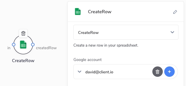
When auth is defined, the component will have a section in the Designer UI inspector requiring the user to select from existing accounts or connect a new account. Only after an account is selected the user can continue configuring other properties of the component.
The icon representing the component in the UI. It must be in the Data URI image format as described here: https://en.wikipedia.org/wiki/Data_URI_scheme. image/png or image/svg+xml image types are recommended. Example:
(required)
The name of your component. The name must have the following format: [vendor].[service].[module].[component]. Note that all the parts of the name must contain alphanumeric characters only. For example:
The vendor part of the component name is the ID of the author of the component set. service and module allows you to organize your components into categories. These categories not only help you keep your components in a tidy hierarchical structure but it also has a meaning in that you can share your authentication and quota definitions between modules and components (more on that later). component describes the actual component activity.
The component manifest provides information about a component (such as name, icon, author, description and input/outputs definition) in a JSON text file. The manifest file must be named component.json.
Example manifest file:
The definition of the input ports of the component. It's an array of objects.
Each component can have zero or more input ports. If a component does not have any input ports, we call it a trigger. Input ports allow a component to be connected to other components. Input ports receive data from output ports of other connected components when the flow is running and the data is available. Each input port has a name and configuration that has the exact same structure as the configuration of properties, i.e. it has schema , inspector or source objects. The difference is that the user can use placeholders (variables) in the data fields that will be eventually replaced once the actual data is available. The placeholders (variables) can be entered by the user using the "variables picker" in the Designer UI inspector (see below). Example:
The message from the example looks like this in the raw form:
As you can see, the placeholders for variables use a special format that the Appmixer engine eventually replaces with real values that come from the GetCurrentWeather component once the data is available.
Definition of the schema of the data that the input port expects. Please see the Properties Schema section for more details.
Definition of the inspector UI for this input port. Please see the Properties Inspector section for more details.
Definition of the source of the variables or dynamic inspector that will be available in the designer UI for this input port.
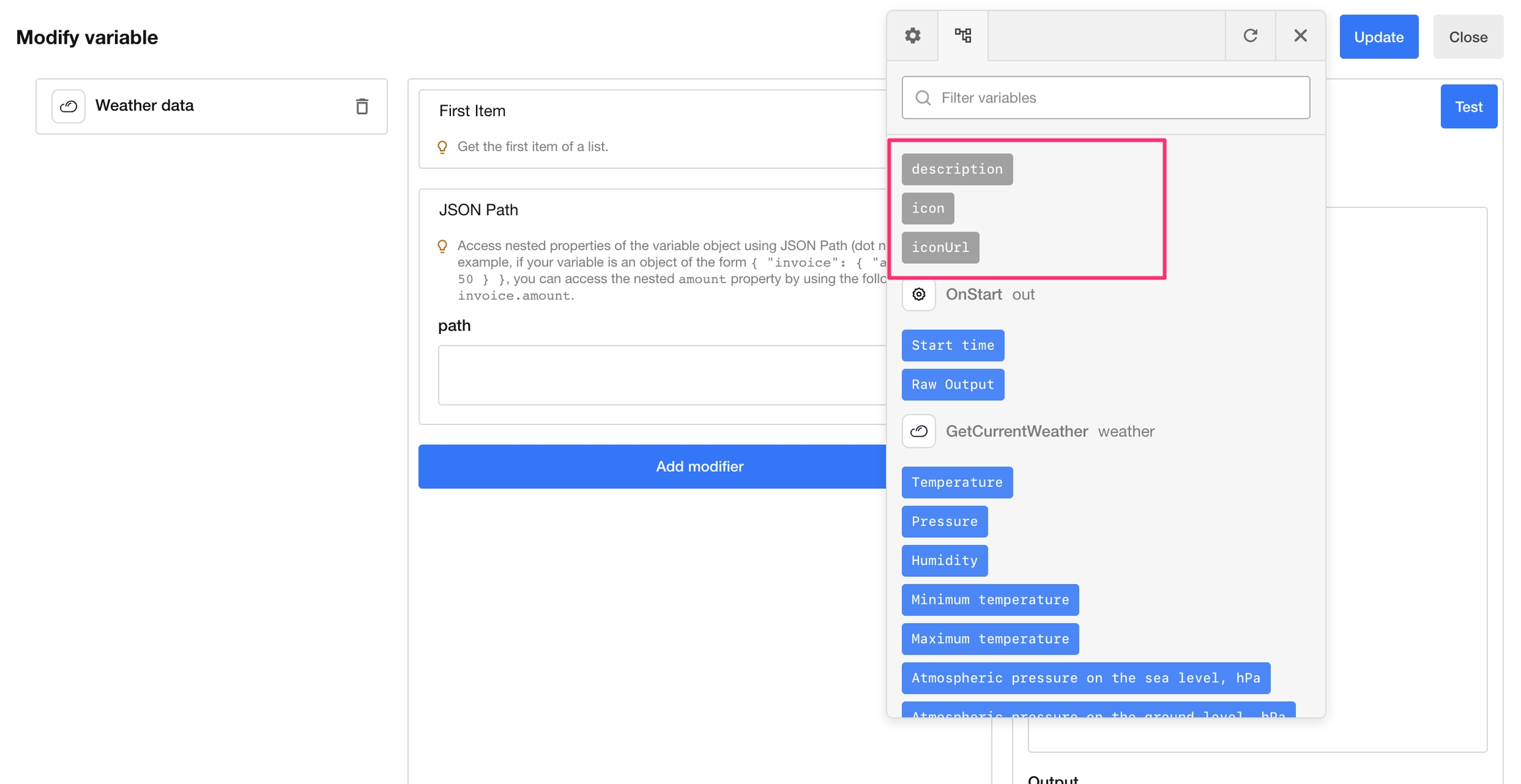
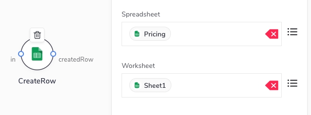
An example of how the source property can be used to generate the input port Inspector dynamically for the appmixer.google.spreadsheets.CreateRow component. When showing the Inspector for the CreateRow, we need to know the structure (columns) of the Worksheet, the Inspector input fields will copy the columns in the Worksheet
Note how we mapped the configuration properties of the CreateRow component to the configuration properties of the ListColumns component that is called internally to retrieve the list of columns. The data.properties section defined property mappings. To map input port values, you can use the data.messages section instead. Let's see another example of a component, this time with input message mappings, the trello.list.CreateCard component inspector definition:
As you can see, the boardId (referenced to by the "inputs/in/boardId" syntax) configured by the end-user on the CreateCard component is mapped into the input port property of the same name of the ListBoards component ("in/boardId").
This object allows you to control what variables will be available to this component in the UI and in the component receive() method. By default, variables are collected from all the components back in the chain of connected components. This might not be desirable in some cases. One can set scopeDepth to a number that represents the depth (levels back the graph of connected components) used to collect variables. rawValue can be used to tell the engine not to resolve variable placeholders to their actual values but to treat variable names as values themselves. Example:
Set the maximum number of links that can be connected to the input port. Maximum number of connections is infinite by default but in some applications, it might be desirable to set a limit on this, usually 1. The Appmixer Designer UI will not allow the user to connect more than maxConnections links to the input port.
Set webhook property to true if you want your component to be a "webhook" type. That means that context.getWebhookUrl() method becomes available to you inside your component virtual methods (such as receive()). You can use this URL to send HTTP requests to. See the section, especially the for details and example.
Configuration of the quota manager used for this component. Quotas allow you to throttle the firing of your component. This is especially useful and many times even necessary to make sure you don't go over limits of the usage of the API that you call in your components. Quota managers are defined in the quota.js file of your service/module. Example:
The name of the quota module where usage limit rules are defined.
One or more resources that identify rules from the quota module that apply to this component. Each rule in the quota module can have the resource property. quota.resources allow you to cherry-pick rules from the list of rules in the quota module that apply to this component. quota.resources can either be a string or an array of strings.
This scope instructs the quota manager to count calls either for the whole application (service) or per-user. Currently, it can either be omitted in which case the quota limits for this component apply for the whole application or it can be { "userId": "{{userId}}" } in which case the quota limits are counted per Appmixer user.
When set to true, the component will receive signals in regular intervals from the engine. The tick() Component Virtual method will be called in those intervals (see Component Behaviour). This is especially useful for trigger-type of components that need to poll a certain API for changes. The polling interval can be set by the COMPONENT_POLLING_INTERVAL environment variable (for custom on-prem installations only). The default is 60000 (ms), i.e. 1 minute.
When set to true, the component will not be visible to end users.
By default, you can send GET, POST, PUT, or DELETE HTTP requests to a component. With the property httpRequestMethods you can define, which HTTP methods are allowed. Additionally, you can add support for the OPTIONS method:
The definition of the output ports of the component. It's an array of objects.
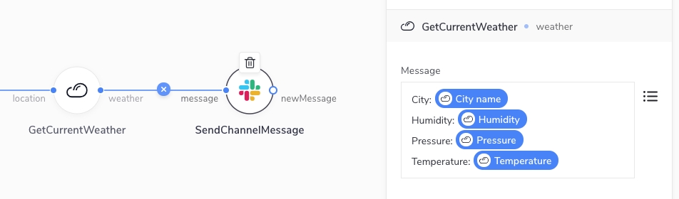
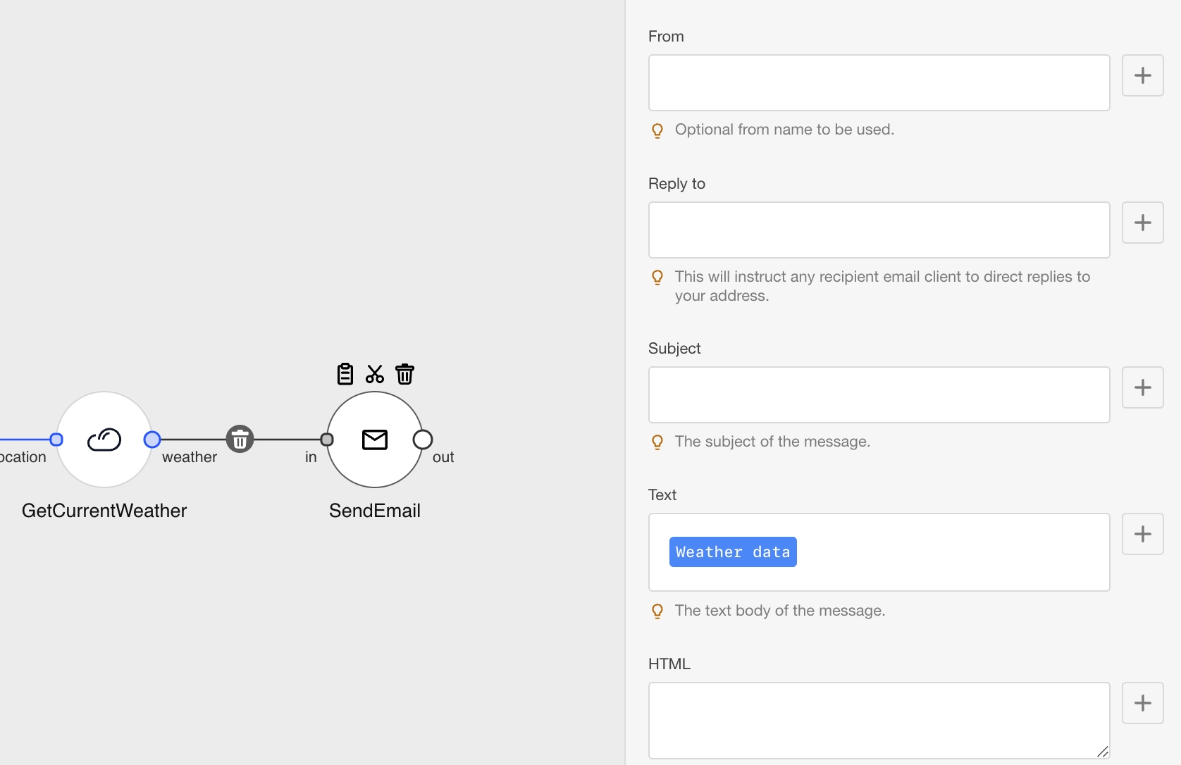
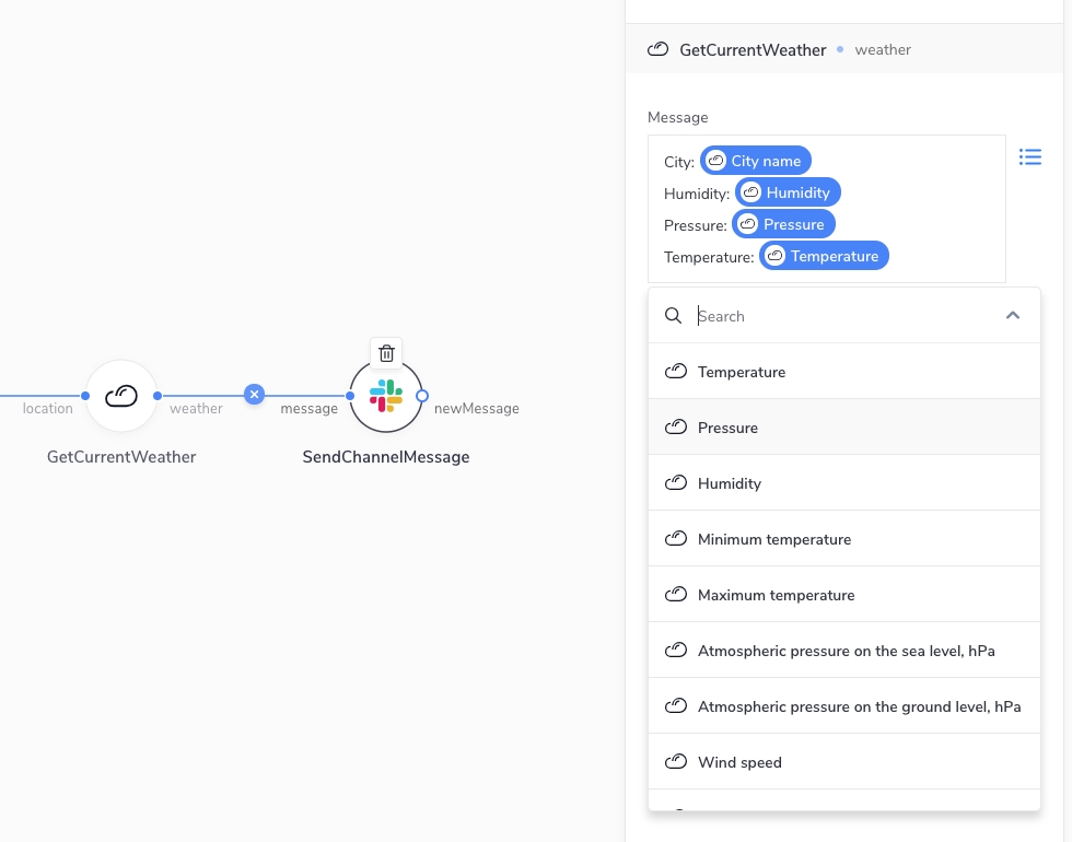
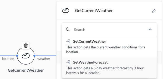
Components can have zero or more output ports. Each output port has a name and optionally an array options that defines the structure of the message that this output port emits. Without the options object, the user won't be able to see the possible variables they can use in the other connected components. For example, a component connected to the weather output port of our GetCurrentWeather component can see the following variables in the variables picker:
An example of an outPorts definition can look like this:
We support full schema definition for each option, so you can specify the structure of the data that is coming out from your component. You can add a schema property to each option, which contains a JSON Schema definition. For example:
As you can see, compared to the first example, we replaced the last 3 options with a single one, which is actually an array of items with three properties. Each of these items has title which determines the label that will be visible in the UI. Note that the type of these inner properties could be an object or array, and have their own nested schemas.
If the option is defined as an array and you want to work with that array using modifiers:
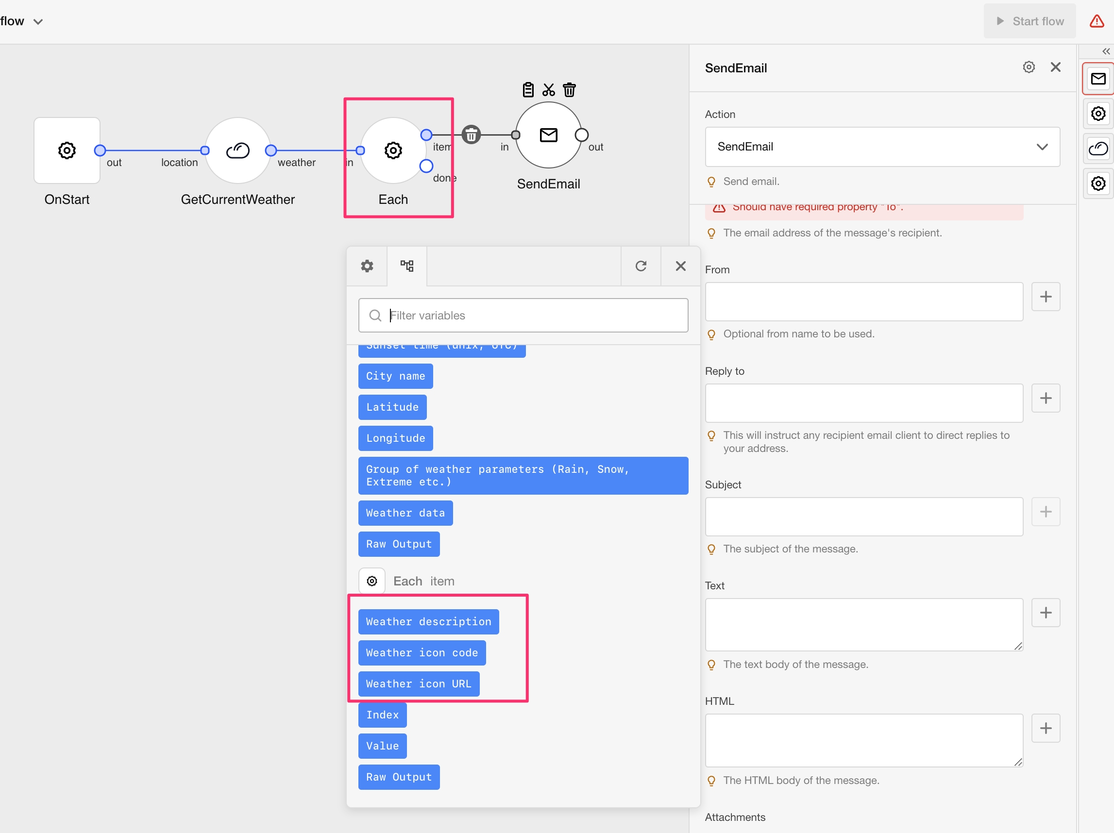
You will see the item properties among other variables.
And if you use the Each connector, you will see the item properties in the Variables picker.
Alternatively, you can define a schema at the top level instead of using the options property. For example:
When you define the structure of the data coming out from your component, the users of your component will have an easier time working with it, as they will be able to do things like selecting nested properties directly, selecting properties on iteration modifiers, and getting properties paths in modifiers. You can find more details about this in this section.
The definition is similar to the source source of properties. When used for the output port definition, it allows defining the output port schema dynamically.
There is one difference though. When defined in the output port, the source definition can reference both component properties and input fields, while the properties source definition can only hold references to other properties' values.
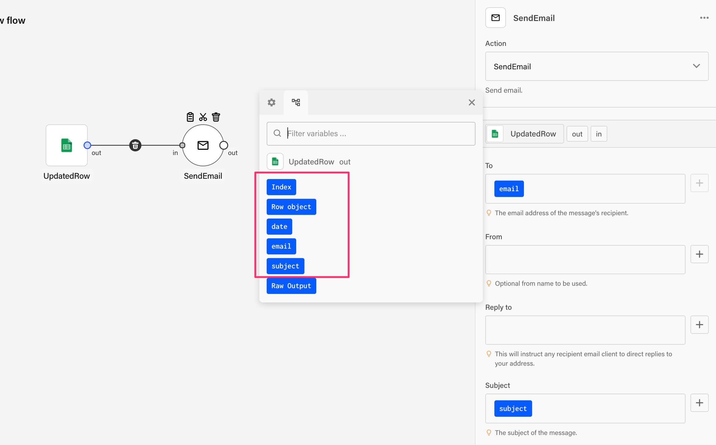
An example is a Google Spreadsheet component UpdatedRow. The output port options of this component consist of the column names in the spreadsheet. But that is specific to the selected Spreadsheet/Worksheet combination. Therefore it has to be defined dynamically.
Here is an example of the UpdatedRow output port definition.
Set the maximum number of outgoing links that can exist from the output port. The maximum number of connections is infinite by default but in some applications, it might be desirable to set a limit on this, usually 1. The Appmixer Designer UI will not allow the user to connect more than maxConnections links from the output port.
The configuration properties of the component. Note that unlike properties specified on input ports (described later on in the documentation), these properties cannot be configured by the user to use data coming from the components back in the chain of connected components. In other words, these properties can only use data that is known before the flow runs. This makes them suitable mainly for trigger type of components.
Configuration properties are defined using two objects schema and inspector.
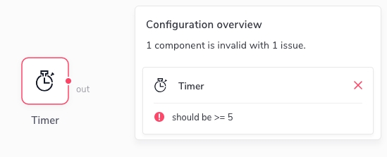
The JSON Schema gives you enough flexibility to describe your property types and the required format, possibly using regular expressions or other mechanisms. When the user fills in the forms in the Designer UI inspector to configure their components, the Designer automatically validates all inputs using the schema. If any of the properties are invalid, the Designer UI gives an immediate feedback to the user that they should correct their configuration:
Do not use special characters . or / in the name of the input.
As you can see, fields (e.g. interval in this case) are nested inside the inputs object and have the following properties:
type can be any of the built-in types. See below for more details. (Custom inspector fields are also possible for on-prem installations. See the Custom Inspector Fields page for more details.)
group is an identifier of an Inspector group this field belongs to. As you can see in the example above, you can have one or more custom groups (like config in this case) that you can define in the groups object. Groups will render in the Inspector UI in an accordion-like fashion. This is handy to organize your fields.
label is a short text that appears above your input field. This is a great place to tell your users what your field is.
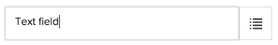
A single line input field.
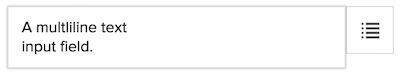
A multi-line text input field.
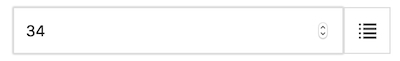
A numerical input field. Additional configuration includes min, max and step numbers.
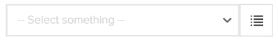
A menu of options. Options are defined in the options array each item having content and value properties. Note that content can be HTML. You can optionally provide placeholder that is displayed if no option is selected. Default values can be defined with defaultValue. If you need one of the items to clear the value of the select input field, use { "clearItem": true, "content": "Clear" } as one of the objects in the options array.
Similar to select type, multiselect defines options the user can choose from. The difference is that with multiselect, the user can select multiple options, not only one. The value stored in the flow descriptor is an array of values the user selected. Supported options are options and placeholder.
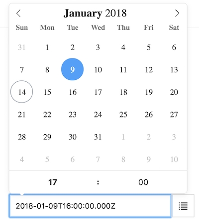
A date-time input field allows the user to select a date/time using a special date/time picker interface. The date-time input field can be configured to support different type of formats or modes (only date or date-time combination). The configuration is stored in the "config" object. The following table shows list of all the available options:
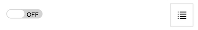
A toggle input field allows the user to switch between true/false values.
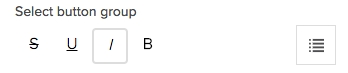
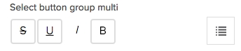
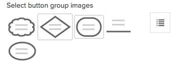
A group of toggle buttons. Both single and multiple selection is allowed (can be controlled with the multi flag). Buttons are defined in the options array each item having value, content and icon properties.
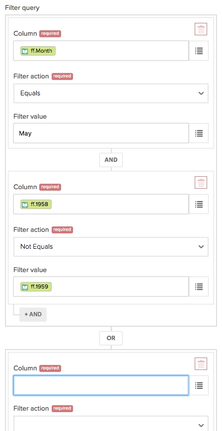
A multi-field type field that allows for the definition of logical expressions (OR/AND) or dynamic field definitions. This field accepts a list of other inspector field types (text, textarea, number, toggle, ....) and renders a "field builder" UI that enables the user to dynamically create nested fields.
The value of this field has the following structure:
Note that by specifying the levels option, you can define the nesting. Currently, a maximum of 2 levels of nesting is supported. The common use case is to use just one level. In that case, set e.g. "levels": ["ADD"].
The exclusiveFields is an optional property that defines the fields that will use variables in an exclusive way. For example, let's say that the component has variableA and variableB available for use in its fields. Now if the myText field is in exclusiveFields array which means that you can use each variable once across all the fields inside the expression groups. To clarify this further, imagine the following scenario configuring an expression type:
Click the ADD button to create a second group.
Select variableA on the myText field inside the first group using the variables picker.
When opening the variables picker in myText field inside the second group, only variableB will be available, because variableA is already been used.
This is how it is done:
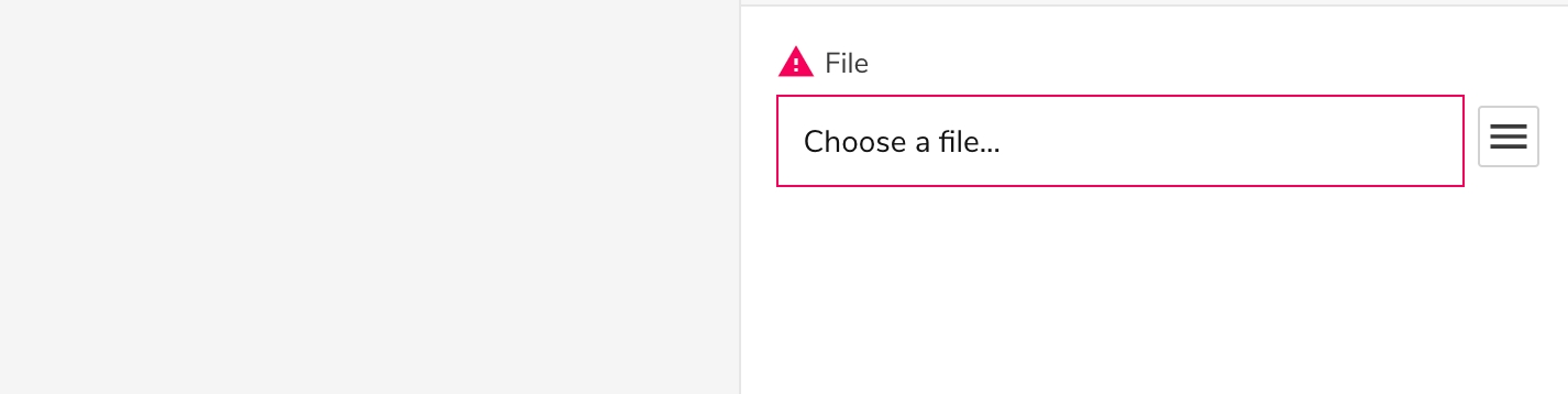
An input that allows selecting and uploading files from the user's computer. When clicked, it will open the browser's file selector, and the file selected will be uploaded to Appmixer and referenced on the input.
Similar to the filepicker input, this one allows users to select files or folders on their Google Drive accounts. When clicked a Google Drive file picker is opened, showing the user's Google Drive content. When selecting a folder/file, the input value becomes an object which includes the Id of the folder/file which should be used on Google API calls to reference that asset.
You can use googlepicker to pick folders instead of files:
This input type needsappmixer.google.drive.GooglePicker component to be installed.
Similar to the googlepicker, this one allows users to select files or folders from their OneDrive accounts. When clicked, an OneDrive file picker is opened, showing the user's OneDrive content. When selecting a folder/file, the input value becomes an object which includes the id of the folder/file which should be used on OneDrive API calls to reference that asset.
The view property works similar to the same property on googlepicker. It can be used to determine what is shown on the picker. You can use 3 values: files, folder, all. As their names indicate, if select files, only files will be shown, if you select folder it will show only your folders and if you select all it will show both. This input type needs appmixer.microsoft.onedrive.OneDrivePicker component to be installed.
There are some cases when you want to show input fields depending on other values in the inspector. This allows to a better UX for component configuration. For this we use the whenproperty in the field we want to be conditional:
The when field has the following structure: { op: { field: comparisonValue }}.
op: Is the operand that will be used to determine if the condition holds true or false. The following operands are supported:
eq: Equality between the values.
equal: Equality between the values by deep comparison. Used for objects and arrays.
ne: Values are not equal.
regex: Check if the value in given field matches the regex in the comparisonValue.
text: Check if the value in the given field contains the string in the comparisonValue.
lt: Check if the value in the given field is less than the comparisonValue.
lte: Check if the value in the given field is less or equal than the comparisonValue.
gt: Check if the value in the given field is greater than the comparisonValue.
gte: Check if the value in the given field is greater or equal than the comparisonValue.
in: Check if the value in the given field is included on the given comparisonValue array.
nin: Check if the value in the given path is not included in the given comparisonValue.
field: The field that is used for comparison, there are several ways to reference the field:
field: The same form presented in the example. It will search the given fields in current input port fields.
properties/someProperty: Refer to a property inside component properties.
./field: It will refer to sibling fields of the current field. Specially useful when working with expression types.
comparisonValue: The value used to compare the field against.
As it was mentioned, conditional fields also work with expression types, allowing to control the field rendering inside those expressions:
Sometimes the structure of the inspector is not known in advance and it cannot be hardcoded in the manifest. Instead, the inspector fields are composed dynamically based on the data received from an API. A good example is the google.spreadsheets.CreateRow component where the inspector renders fields representing columns fetched from the actual worksheet. For this to work, we can define the source property in the manifest that calls a component of our choosing in a so called "static" mode. For example:
In the example above, we call the ListColumns component and we're interested in the output coming from the output port out.Since this is just a normal component, we need to transform the result into the inspector-like object, i.e.:
We need to tell Appmixer where it can find the transformation function. For this we use the transform property which tells Appmixer to look for the transformers.js file inside the ListColumns/ directory. The transformer must return an object with a function named columnsToInspector that can look like this:
A special URL that identifies a component that should be called in a "static" mode. It has to be of the form /component/[vendor]/[service]/[module]/[component]. It should also contain outPort in the query string that point to the output port in which we're interested to receive data from. Example:
Messages that will be sent to the input port of the component referenced by the properties.source.url. Keys in the object represent input port names and values are any objects that will be passed to the input port as messages.
Properties that will be used in the target component referenced by the properties.source.url. The target component must have these properties defined in its manifest file. The values in the object are references to the properties of the component that calls the target component in the static mode. For example:
The transformation function used to transform the output of the target component. It should return an inspector-like object, i.e.:
Example:
The transform function is pointed to be a special format [module_path]#[function], where the transformation module path is relative to the target component directory.
schema is a JSON Schema definition () of the properties, their types and whether they are required or not. An example looks like this:
inspector tells the Designer UI how the input fields should be rendered. The format of this definition uses the . Example:
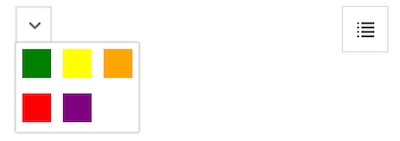
A menu of colors. Colors are defined in the options array each item having content and value properties, where values must be a color in any of the (named-color, hex-color, rgb() or hsl()).
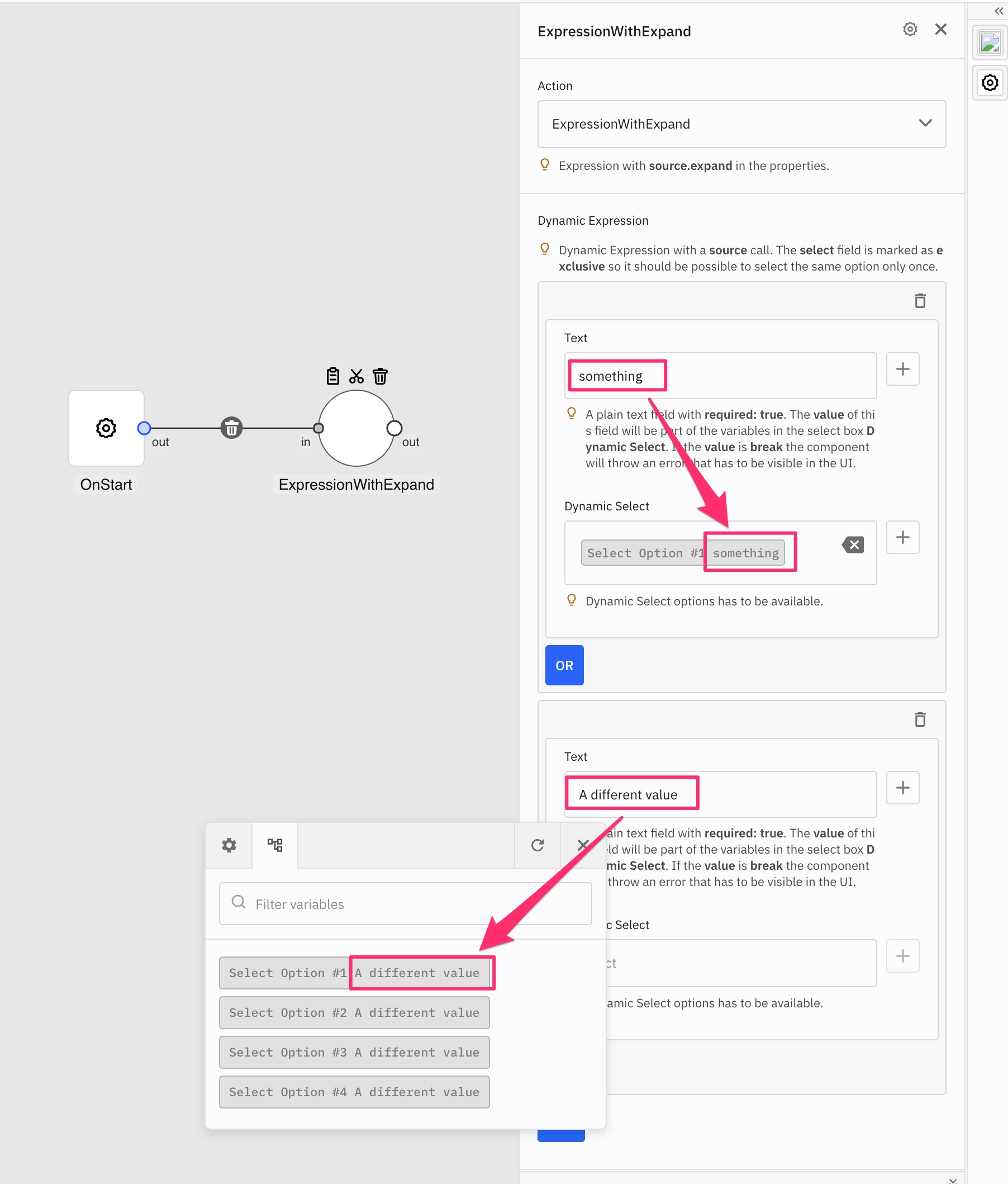
The expand option in source. The select inputs in the expression can have dynamic values retrieved with the configuration (just like an ordinary select input). Sometimes you may want to define different dynamic values for every expression box based on another field(s) in that box:
Option
Description
format
String representing the format of the date/time. Please see the moment.js library documentation for all the available tokens: https://momentjs.com/docs/#/parsing/string-format/.
enableTime
Boolean. Enables time picker.
enableSeconds
Boolean. Enables seconds in the time picker.
maxDate
String representing the maximum date that a user can pick to (inclusive).
minDate
String representing the minimum date that a user can pick to (inclusive).
mode
Mode of the date/time picker. Possible values are "single", "multiple", or "range".
time_24hr
Boolean. Displays time picker in 24 hour mode without AM/PM selection when enabled.
weekNumbers
Boolean. Enables display of week numbers in calendar.
The author of the component. Example:
Set state property to { persistent: true } to tell the engine not to delete component state when flow is stopped. See context.state for more information.
An optional object containing localization strings. For example:
For more information about component localization, refer to the Custom Component Strings section.
Fire patterns is an advanced configuration of a component that allows you to define when your component is ready to fire (ready to process input messages). Fire patterns can make the engine to hold input messages on components input ports until the pattern matches and then send the messages to the component in bulk. Fire patterns are defined as an array or a matrix. An example of fire patterns may look like this:
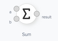
The fire pattern above is interpreted as follows: The component processes messages only if the first input port has zero or more messages waiting in the queue and at least one message waiting in the second input port queue. Another example can be a fire pattern:
In this case, the component only processes messages if there is at least one message on each of its two input ports. A good example for this pattern is the Sum component:
The Sum component expects messages on both of its input ports before it can produce a sum of its inputs.
The following table lists all the possible fire pattern symbols:
Symbol
Description
*
(Any) The input port must have zero or more messages in the queue.
1
(Exists) The input port must have at least one message in the queue.
0
(Empty) The input port must have no message in the queue.
A
(All) The input port must have at least one message from all the connected components in the queue. This is a synchronization pattern that lets you specify that the component must wait for all the connected components to send a message before it can start processing. A typical example is a "Multiple-to-Single" join component. This component must wait for all the LoadCSV components to send a message before it can produce an SQL-like join schema.
Note that you can also define a set of fire patterns for a component, for example:
When more fire patterns are used, there must be at least one fire pattern that matches before the component fires.
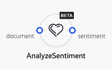
The marker icon that can be added to the component in the UI to give some extra context. The most common use case is to display e.g. a "Beta" badge to tell the user that this component is in beta. The marker must be in the Data URI image format as described here: https://en.wikipedia.org/wiki/Data_URI_scheme. image/png or image/svg+xml image types are recommended. The marker icon is displayed in the top right corner of the component shape.
Example: