> For the complete documentation index, see [llms.txt](https://docs.appmixer.com/llms.txt). Markdown versions of documentation pages are available by appending `.md` to page URLs; this page is available as [Markdown](https://docs.appmixer.com/appmixer-ui-sdk/ui-and-widgets/designer.md).
# Designer
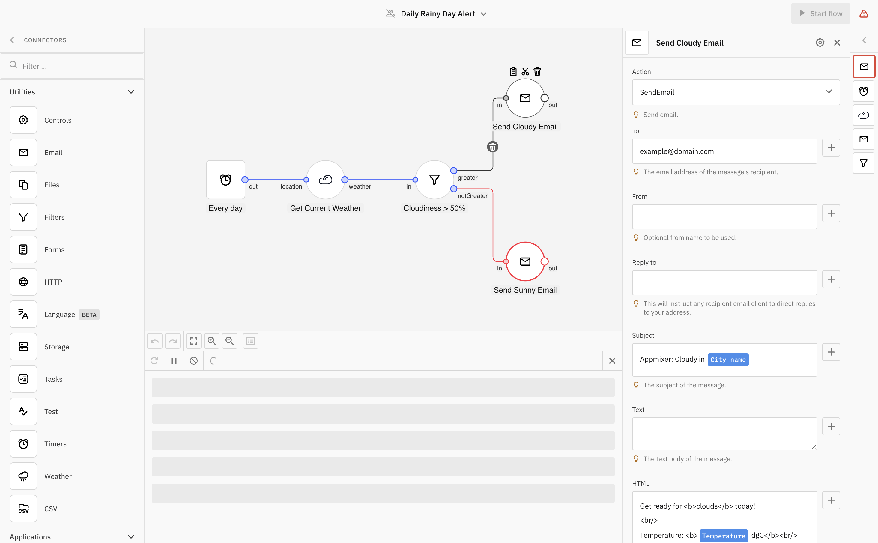
Build, edit and inspect individual flows in a comprehensive editor.
Designer
## Diagram
The Designer renders flows with a redesigned diagram engine. The new diagram uses the **Modern** theme by default, in both light and dark modes, and is the production default wherever the standard left-to-right layout is in use.
* The layout comes from the **theme**, not from individual flows: when the themed `action` and `trigger` [shapes](/customizing-embedded-ui/custom-theme.md#shapes) carry `orientation: 'bottom'` — the vertical shape presets — the Designer falls back to the previous diagram for every flow. Detection is keyed on that attribute rather than on the shape name, so custom shapes registered with `appmixer.registerComponentShape` participate too. The top-to-bottom layout is kept as a backup only and is scheduled for removal in a future release.
* The layout setting travels inside the theme, and changing the theme unmounts and remounts the Designer, so the orientation is resolved once per Designer lifetime.
* The new diagram supports one-click re-layout of the flow — see the `align` toolbar button below.
* Zooming with the pointer follows the platform convention: **⌘ + scroll** on macOS and **Ctrl + scroll** on Windows and Linux zoom about the pointer. On macOS, ⌘ + scroll previously panned the canvas; on Windows and Linux, Super + scroll still pans.
## Configuration
Set up a new instance with `config` parameters and `set`/`get` methods:
```javascript
const designer = appmixer.ui.Designer(config)
designer.set(key, value)
designer.get(key)
```
#### **`config.el`** **`...`**
{% hint style="info" %}
Learn about `widget` `config` [here](/appmixer-ui-sdk/ui-and-widgets.md#configuration).
{% endhint %}
#### **`config.flowId`**
Type: `String` | Default: `null`
ID of a flow that is opened in the editor.
#### **`config.componentId`**
Type: `String` | Default: `null`
ID of a component that is opened in the editor.
#### **`config.shareTypes`**
Type: `Object` | Default: `DefaultShareTypes`
Override default sharing dialog types.
#### **`config.sharePermissions`**
Type: `Object[]` | Default: `DefaultSharePermissions`
Override default sharing dialog permissions.
#### **`config.options.showHeader`**
Type: `Boolean` | Default: `true`
Toggle visibility of the header.\
\
\&#xNAN;**`config.options.validation`**
Type: `Object` | Default: `{}`
Controls validation panel settings.\
\
**Properties:**
* `show` (`Boolean`, default: `false`). Toggles visibility of the validation panel.
**Example:**
```javascript
appmixer.ui.Designer({
/* ... */
options: {
validation: { show: true }
}
})
```
{% hint style="info" %}
Additional `validation` options may be added in future versions.
{% endhint %}
#### **`config.options.menu`**
Type: `Object[]` | Default: `[]`
Add a dropdown menu input to trigger built-in and custom events:
```javascript
appmixer.ui.Designer({
/* ... */
options: {
menu: [
{ event: 'flow:rename', label: 'Rename', icon: 'data:image/svg+xml;base64,...' },
{ event: 'flow:share', label: 'Share', icon: 'https://www.example.com/images/image.jpg' },
{ event: 'flow:wizard-builder', label: 'Wizard' },
{ event: 'flow:export-svg', label: 'Export SVG' },
{ event: 'flow:export-png', label: 'Export PNG' },
{ event: 'flow:print', label: 'Print' }
]
}
})
```
{% hint style="info" %}
The *optional* `icon` property is a URL of an image or a `base64` string.
{% endhint %}
#### **`config.options.toolbar`**
Type: `Array[]` | Default: `[]`
Add a toolbar with groups of built-in and custom buttons:
```javascript
const designer = appmixer.ui.Designer({
/* ... */
options: {
toolbar: [
['undo', 'redo'],
['zoom-to-fit', 'zoom-in', 'zoom-out'],
['logs'],
[{
tooltip: 'Reload',
widget: {
template: (
`
`
),
methods: {
onClick() {
designer.reload()
}
}
}
}]
]
}
})
```
{% hint style="info" %}
Specify Vue [`ComponentOptions`](https://vuejs.org/api/component-instance.html#options) under `widget` to create a custom toolbar button.
{% endhint %}
**`'align'`**
The `align` button key adds an **Align Diagram** button that re-arranges the whole flow into a clean, layered left-to-right layout with a single click. Branches are ordered by the output port their links leave from, notes are never moved, and the re-layout finishes with a zoom-to-fit. The alignment only changes component positions — links, ports and the flow logic are untouched — and it is persisted as a single flow update, so it can be undone in one step.
```javascript
appmixer.ui.Designer({
/* ... */
options: {
toolbar: [
['undo', 'redo'],
['zoom-to-fit', 'zoom-in', 'zoom-out'],
['align'],
['logs']
]
}
})
```
{% hint style="info" %}
The button is available only with the new diagram (left-to-right layouts) and is disabled when the Designer is read-only. Removing the `'align'` string from the `toolbar` array fully disables the feature.
{% endhint %}
**`'commands'`**
The `commands` button key adds a **View Commands** button that opens the **Keyboard Commands** panel — a floating panel beside the canvas listing every keyboard and pointer shortcut the Designer supports, from copy/paste and undo/redo to marquee selection, nudging and note editing. Each row shows the macOS and the Windows/Linux binding, and the row highlights as you press its shortcut. Keystrokes aimed at text fields are ignored, so typing in an inspector field never flashes a row.
```javascript
appmixer.ui.Designer({
/* ... */
options: {
toolbar: [
['undo', 'redo'],
['zoom-to-fit', 'zoom-in', 'zoom-out'],
['align', 'commands'],
['logs']
]
}
})
```
{% hint style="info" %}
The button sits between Zoom Out and Logs and is available only with the new diagram. Removing the `'commands'` string from the `toolbar` array fully disables it. The panel is themable under the `'#Designer/#commandsPanel'` scope.
{% endhint %}
**`'logs'`**
The `logs` button key adds the **View Logs** button, and `integration-test-logs` adds **View Test Logs** for integration tests. Together they decide whether the Designer's built-in logs panel is available at all — they are not only about the buttons.
```javascript
appmixer.ui.Designer({
/* ... */
options: {
toolbar: [
['undo', 'redo'],
['zoom-to-fit', 'zoom-in', 'zoom-out'],
['logs']
]
}
})
```
{% hint style="info" %}
With neither key in the `toolbar` array, the whole panel is switched off: the View Logs button and the chevron toggle on the right of the toolbar are both gone, a running flow no longer opens logs by itself regardless of the `autoOpenLogs` option below, and a test run's **View logs** links — on the result badge and in a component's test-output popover — are not offered. Use this when your application shows flow logs in its own UI.
{% endhint %}
#### **`config.options.autoOpenLogs`**
Type: `Boolean` | Default: `true`
Automatically open logs view when the flow is running. It applies only while the toolbar offers a logs button — with the logs keys removed from `toolbar`, the built-in panel is switched off and nothing opens it (see the `'logs'` key under `config.options.toolbar` above).
The logs panel refreshes automatically while its tab is active. Polling is suspended while the browser tab is hidden and resumes when the tab becomes active again; if the API rate-limits the requests, the panel backs off and recovers on its own.
```javascript
const designer = appmixer.ui.Designer({
/* ... */
options: {
autoOpenLogs: true
toolbar: [
['logs']
]
}
})
```
#### **`config.options.triggerSelector`**
Type: `Object` | Default: `null`
Configures how a flow with no trigger invites the user to add one. When `enabled` is `true`, an empty canvas shows a placeholder with an **Add a trigger** tile and, where the AI Copilot is available, a **Build with AI** tile. Choosing **Add a trigger** opens the trigger selector dialog, whose top entries can be curated with `featured`.
| Property | Type | Default | Description |
| ---------- | --------- | ------- | -------------------------------------------------------------------------------------------------------------------------------------------------------------------------------------------------------- |
| `enabled` | `Boolean` | `false` | Turns the trigger selector on. |
| `autoOpen` | `Boolean` | `false` | Restores the legacy behaviour — the trigger selector dialog opens by itself on a flow with no trigger. Mutually exclusive with the placeholder: when `autoOpen` is `true`, the placeholder is not shown. |
| `featured` | `Array` | — | Components pinned to the top of the dialog, optionally with a custom label, description, marker and icon. |
```javascript
const designer = appmixer.ui.Designer({
/* ... */
options: {
triggerSelector: {
enabled: true,
autoOpen: false,
featured: [
{
name: 'appmixer.utils.timers.Timer'
},
{
name: 'appmixer.utils.controls.OnStart',
label: 'Custom label',
description: 'Custom description',
marker: 'Custom marker text',
icon: 'data:image/svg+xml;base64,...',
}
]
}
}
})
```
{% hint style="info" %}
The placeholder requires a genuinely empty canvas — no components **and** no notes — so the centred tiles never cover existing content. The **Build with AI** tile additionally requires the Copilot system plugin to be enabled on the backend and a surface that allows Copilot; it is hidden in integration template mode.
{% endhint %}
#### **`config.options.copilot`**
Type: `Object` | Default: `null`
Configuration of the [AI Copilot](/getting-started/ai-copilot.md) panel. The Copilot button is shown only when the Copilot plugin is enabled on the backend.
```javascript
const designer = appmixer.ui.Designer({
/* ... */
options: {
copilot: {
// Show the built-in, localized example prompts:
examplePrompts: true
// — or — provide your own (replaces the defaults):
// examplePrompts: [
// 'When a Stripe payment succeeds, add a row to Google Sheets'
// ]
// Omit or set false to keep them hidden (default).
}
}
})
```
{% hint style="info" %}
The Designer also includes a **Test flow** button that executes a single test run of the flow without starting it (streaming per-component results onto the canvas, with dedicated test-input dialogs for Webhook, Form and Chat triggers), a **Versioning panel** with the flow's version history and draft management (see [Flow Versions](/api/flows.md#flow-versions)), a floating **validation panel** that replaces the validation sidebar, and per-component **Error handling** settings (see [Handle Flow Errors](/getting-started/system-webhooks.md)).
{% endhint %}
## Instance
{% hint style="info" %}
Learn about `widget` instance [here](/appmixer-ui-sdk/ui-and-widgets.md#instance).
{% endhint %}
### State
```javascript
designer.state(name, value)
```
#### **`loader`**
Type: `Boolean` | Default: `null`
Toggle a custom loading state.
#### **`error`**
Type: `String` | Default: `null`
Toggle a custom error message.
**`stencilLayout`**
Type: `String` | Default: `'default'`
Sets the stencil panel layout to `'default'` (expanded) or `'collapsed'`.
**`validationLayout`**
Type: `String` | Default: `'default'`
Sets the validation panel layout to `'default'` (expanded) or `'collapsed'`.
**`copilotSessions`**
Type: `Object` | Default: `{}`
Pointers to the AI Copilot conversations the user has started, as a `{ [contextKey]: threadId }` map — `contextKey` is `'flow:'` for a conversation bound to a flow.
Treat the map as opaque: read it, store it, hand it back. Its purpose is to let a Copilot conversation survive a page reload — persist it (for example to `sessionStorage`) when the Designer fires the `change` event, and pass it back in `state` the next time you create the Designer. Reopening the same flow then resumes its conversation instead of starting a new one.
It holds the conversation *context* only, never the messages: the backend owns the transcript and the panel restores it from the `threadId` when the conversation is reopened.
```javascript
const designer = appmixer.ui.Designer({
el: '#designer',
state: {
copilotSessions: JSON.parse(sessionStorage.getItem('copilotSessions') || '{}')
}
})
designer.on('change', state => {
sessionStorage.setItem('copilotSessions', JSON.stringify(state.copilotSessions))
})
```
### Methods
#### **`designer.copilot.send`**
```javascript
const { sent, reason } = await designer.copilot.send(message)
```
{% hint style="info" %}
Available since Appmixer 6.5.5.
{% endhint %}
Opens the [AI Copilot](/getting-started/ai-copilot.md) panel and submits `message` into the conversation the user can see, exactly as if they had typed it in the composer.
Use it to drive Copilot from your own UI — for example a **Fix it with Copilot** button in a dialog that explains what a flow created from a template still needs from the user.
Everything else about the prompt is unchanged: the reply streams into the panel, `copilot:chat-start` fires for a new conversation, the thread is retained in `copilotSessions`, and the confirmation the composer shows before creating or replacing an automation draft is shown for an SDK prompt too.
The promise resolves once the prompt has been **submitted** — not when Copilot has finished answering.
Calling it immediately after `designer.set('flowId', id)` is safe: the prompt waits for the flow to finish loading before it is sent. A flow that cannot be loaded at all — a wrong or inaccessible id — is reported as `no-flow`, which can take up to 30 seconds.
| Property | Type | Description |
| -------- | --------- | ---------------------------------------------------- |
| `sent` | `Boolean` | Whether the prompt was submitted. |
| `reason` | `String` | Why it was not. Present only when `sent` is `false`. |
| `reason` | Meaning |
| --------------- | -------------------------------------------------------------------------------------------------------------------------------------------------------------------------------------------------------------------- |
| `unavailable` | The Copilot plugin is not enabled on the backend, or this Designer runs in integration template mode. |
| `not-mounted` | The Designer is not open — `designer.open()` has not been called, `designer.close()` has, or it was closed while the prompt was waiting. |
| `no-flow` | No flow is open, or the flow could not be loaded. |
| `busy` | A Copilot request or a test run is already working on this flow, or an earlier `send()` is still being processed. Worth retrying when it finishes. |
| `declined` | The prompt reached Copilot and was not sent: the user dismissed the draft confirmation, or it was superseded first — the flow was switched while the confirmation was on screen, or another request claimed Copilot. |
| `empty-message` | The message was empty or whitespace only. |
| `error` | The Designer failed on its way to sending; the reason is logged to the browser console. |
A refused prompt leaves the Designer as it was — with one deliberate exception: `declined` means the user was asked something, so the panel is open, showing the question they answered.
```javascript
const designer = appmixer.ui.Designer({ el: '#designer' })
designer.open()
designer.set('flowId', flowId)
// Your own "Fix it with Copilot" button:
const { sent, reason } = await designer.copilot.send(
'This flow was created from a template. Help me fill in the product fields.'
)
if (!sent && reason === 'busy') {
showHint('Copilot is still working on the previous request.')
}
```
{% hint style="info" %}
Sending a message straight to the Copilot API instead reaches the same server-side conversation, but it will **not** appear in an open panel — the panel renders its own transcript. Use this method whenever the user should see the prompt.
{% endhint %}
### Events
```javascript
designer.on(event, handler)
```
#### **`flow:start`**
```javascript
designer.on('flow:start', flow => {/* ... */})
```
Toggle stage button to start the flow.
#### **`flow:stop`**
```javascript
designer.on('flow:stop', flow => {/* ... */})
```
Toggle stage button to stop the flow.
#### **`flow:share`**
```javascript
designer.on('flow:share', flow => {/* ... */})
```
Click menu item to open sharing of the flow.
#### **`flow:rename`**
```javascript
designer.on('flow:rename', flow => {/* ... */})
```
Click menu item to rename the flow.
#### **`flow:export-svg`**
```javascript
designer.on('flow:export-svg', flow => {/* ... */})
```
Click menu item to export diagram of the flow to SVG.
#### **`flow:export-png`**
```javascript
designer.on('flow:export-png', flow => {/* ... */})
```
Click menu item to export diagram of the flow to PNG.
#### **`flow:print`**
```javascript
designer.on('flow:print', flow => {/* ... */})
```
Click menu item to print diagram of the flow.
#### **`flow:validation`**
An event containing an array with flow validation errors. If the array is empty, there are no validation errors in the flow.
```javascript
designer.on('flow:validation', errors => {
console.log('flow:validation', '===>', errors);
});
// Example
[
{
"keyword": "required",
"dataPath": ".text",
"schemaPath": "#/required",
"params": {
"missingProperty": "text"
},
"message": "Should have required property \"Message\".",
"schema": {
"text": {
"type": "string"
}
},
"parentSchema": {
"type": "object",
"properties": {
"text": {
"type": "string"
}
},
"required": [
"text"
]
},
"data": {
"message.d9a25ebe-84ef-4460-a061-f9acac76d28f.out.lambda": {}
},
"componentId": "d1c48d6f-0225-46a8-9600-1c19adf75768",
"descriptorPath": "config.transform.message.d9a25ebe-84ef-4460-a061-f9acac76d28f.out.lambda.text",
"fieldLabel": "Message"
}
]
```
#### **`flow:wizard-builder`**
```javascript
designer.on('flow:wizard-builder', flow => {/* ... */})
```
Click menu item to open a wizard builder dialog.
#### **`component:add`**
```javascript
designer.on('component:add', ({ data, next }) => {/* ... */})
```
Add a new component to the flow.
#### **`component:open`**
```javascript
designer.on('component:open', ({ data, next }) => {/* ... */})
```
Open component inspector.
#### **`component:close`**
```javascript
designer.on('component:close', ({ data, next }) => {/* ... */})
```
Close component inspector.
#### **`component:rename`**
```javascript
designer.on('component:rename', ({ data, next }) => {/* ... */})
```
Rename a component.
#### **`component:update-type`**
```javascript
designer.on('component:update-type', ({ data, next }) => {/* ... */})
```
Use selection input to change component type.
#### **`navigate:validation`**
```javascript
designer.on('navigate:validation', (flowId) => {/* ... */})
```
Click a button to show validation errors.
#### **`copilot:chat-start`**
```javascript
designer.on('copilot:chat-start', ({ data }) => {/* ... */})
```
An [AI Copilot](/getting-started/ai-copilot.md) conversation has begun. Fires once per conversation, no matter how it was started — the composer, a suggestion chip, or [`designer.copilot.send()`](#methods).
| Property | Type | Description |
| ---------- | ---------------- | ----------------------------------------------------------------------------------------- |
| `threadId` | `String` | The conversation assigned by the backend, which owns its message history. |
| `flowId` | `String \| null` | The flow the conversation was started for. `null` for a conversation not bound to a flow. |
| `context` | `Object \| null` | The same binding, structured: `{ type: 'flow', flowId }`. `null` when no flow is open. |
Resuming a conversation does not fire this event — nothing started. The Designer keeps the pointer in `copilotSessions` for you, so listen to this only if you want the `threadId` for your own purposes.
## Example
```javascript
const designer = appmixer.ui.Designer({
el: '#designer',
options: {
menu: [
{ event: 'flow:rename', label: 'Rename' },
{ event: 'flow:share', label: 'Share' },
{ event: 'flow:wizard-builder', label: 'Wizard' },
{ event: 'flow:export-svg', label: 'Export SVG' },
{ event: 'flow:export-png', label: 'Export PNG' },
{ event: 'flow:print', label: 'Print' }
],
toolbar: [
['undo', 'redo'],
['zoom-to-fit', 'zoom-in', 'zoom-out'],
['logs']
]
}
})
const flowId = await appmixer.api.createFlow('New flow')
designer.set('flowId', flowId)
designer.open()
```
---
# Agent Instructions
This documentation is published with GitBook. GitBook is the documentation platform designed so that both humans and AI agents can read, navigate, and reason over technical content effectively. Learn more at gitbook.com.
## Querying This Documentation
If you need additional information that is not directly available in this page, you can query the documentation by asking a question.
Perform an HTTP GET request on the following URL with the `ask` and `goal` query parameters:
```
GET https://docs.appmixer.com/appmixer-ui-sdk/ui-and-widgets/designer.md?ask=&goal=
```
`ask` is the immediate question: it should be specific, self-contained, and written in natural language.
`goal` is what the user is ultimately trying to achieve, the reason they need the answer. Sharing it helps GitBook give you a better, more relevant answer. A goal is most helpful when it describes the outcome the user wants rather than restating the question. For example, with `ask=how do I create an API token`, a goal like `automate deployments from our CI pipeline` lets GitBook tailor the answer to that use case.
The response will contain a direct answer to the question and relevant excerpts and sources from the documentation.
Use this mechanism when the answer is not explicitly present in the current page, you need clarification or additional context, or you want to retrieve related documentation sections.